Archive
Streaming Twitter data with Microsoft Flow and Power BI
It is already a long time ago that I wrote a blog about streaming data with the ELK stack. Today you see a lot of the so called “no code” solutions. You need only some configurations and that’s it! In this blog I use Microsoft Flow and Microsoft Power BI with the focus on streaming data.
What is Microsoft Flow?
Microsoft FLow creates automated workflows between your favorite apps and services to get notifications, synchronize flies, collect data and more. It looks like the old Yahoo Pipes which was very powerfull. The purpose of Yahoo Pipes was to create new pages by aggregating RSS feeds from different sources. Microsoft Flow has also very much in common with the very popular If This Than That (IFTT) platform. More info about Microsoft Flow here
What is Microsoft Power BI?
Power BI is a suite of business analytics tools that deliver insights throughout your organization. Connect to hundreds of data sources, simplify data prep, and drive ad hoc analysis. Produce beautiful reports, then publish them for your organization to consume on the web and across mobile devices. Everyone can create personalized dashboards with a unique, 360-degree view of their business. More info about Microsoft Power BI here
Suppose we want to create a twitter stream about a live soccer match, we can make a twitter flow in Microsoft Flow (and do a sentiment analyse on the tweet text) and finally create an action to a Power BI API stream endpoint.
Step one, we create a Power BI API endpoint:
Go to https://powerbi.microsoft.com/ and login. If you do not have an account sign up. When logged on find My Workspace → Datasets → Create (the + sign in the upper right corner)

We use the API button to create an API endpoint. Give the stream a name and create the following fields:
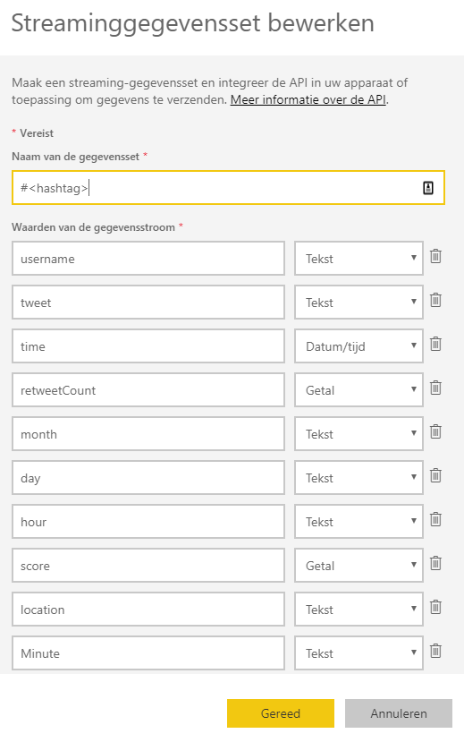
We need some extra time dimension fields month, day, hour and minute to use drill/down features later on in Power BI. The outcome of the sentiment analyse on the tweet text will be placed in the field ‘score’. From 0 to 1 is from more negative to more positive. Power BI show the following field formats.
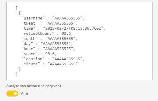
Power BI makes a JSON like format (a REST Webservice on the background). Switch ‘historical data’ to ‘on’, if you will save the data for analysis later in time. You only can access those (historical) dataset with Power BI Desktop if this switch is ‘on’.
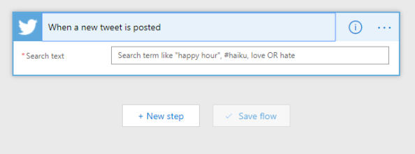
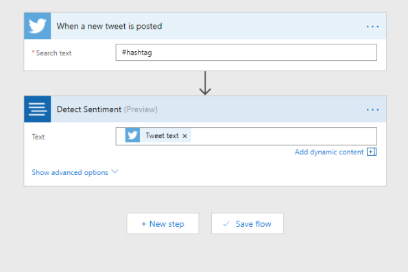
Now we go to Microsoft Flow https://flow.microsoft.com. Login (otherwise sign up for a new account) and ‘create a new flow from blank’. Find the trigger ‘When a new tweet is posted’. Enter a <hashtag>, you can also use boolean operators like ‘AND’ or ‘OR’.
In the next step we add a new action. Use the search word ‘sentiment’ and the connector ‘Text Analytics – Detect Sentiment’. Choose the ‘Tweet text’ field to fill the Text field.
Now enter the last step and add the last action to connect to Power BI. Search for ‘power bi’ in the search box and choose the Power BI connector. Fill in the workspace ‘My Workspace’ and fill in the name of the streaming dataset you give in Power BI earlier. The table field is filled with ‘RealTimeData’.
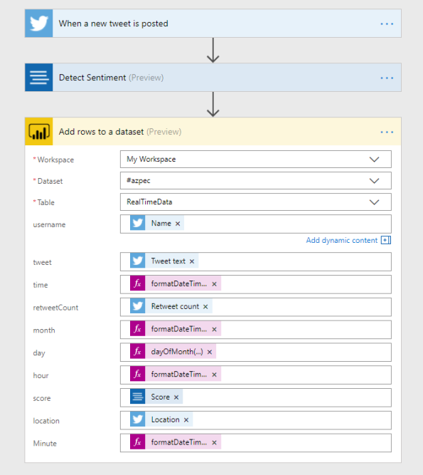
If everything is complete you see the above picture. The twitter fields and the score field of the sentiment analysis is clear. For the time fields we use expressions (I live in the timezone UTC+1).
- time = formatDateTime(addHours(utcNow(),1),’MM/dd/yyyy HH:mm:ss’)
- month = formatDateTime(addHours(utcNow(),1),’MM’)
- day = dayOfMonth(addHours(utcNow(),1))
- hour = formatDateTime(addHours(utcNow(),1),’HH’)
- Minute = formatDateTime(addHours(utcNow(),1),’mm’)
I started my flow on the 31 January 2018 around 17:00 (the start of the match was 18:30) and I used the match AZ against PEC Zwolle (hashtag #azpec) in the quarter final of the KNVB beker. Below some nice charts that I have made in Power BI.

On this charts you see the number of tweets per minute. I also use the Wordcloud chart, that you can import from the marketplace. When you press the minute bar on 18:53, you can see that Wordcloud collect all the words of the tweets that are send on minute 18:53 and we see clearly that Wout Weghorst makes the first goal!

On this chart you can see that the average sentiment around Alkmaar the home place of AZ is more positive, than the rest of the country.
Of course I can show a lot more charts to show you the power of Power BI, but I stop here … 🙂
There are some things that can be better and maybe the Microsoft Power BI team can make this happen in one of the monthly Power BI updates.
- The number of charts are limited when you use the real-time dash board of Power BI. In this blog I collect the data first to use the power of all the available charts.
- You cannot add or enrich more data to a Power BI stream. For example I want to add a time dimension (as a new relation/table) to the streaming data set.
Next time more …